Overview
PROJECT OVERVIEW
As part of a practice-wide Learning & Development campaign, the practice leadership aimed to upskill employees beyond their primary technical expertise by encouraging the adoption of secondary skills. However, tracking the skill acquisition status across hundreds of employees was proving difficult. Without a structured way to assess progress, the initiative struggled to identify low-performing practitioners, recognize top learners, and tailor future interventions.
I was originally part of the marketing team for the initiative, but due to my expertise in visualization tools, I was brought in to design and develop the dashboarding and reporting effort. This cross-functional involvement enabled me to collaborate directly with campaign leadership, the L&D team, and the data collection group. I was later recognized and awarded by the firm for my contributions to the success of this initiative.
Specifics of this project is confidential and cannot be disclosed. However, I have provided a basic overview of work I have done as part of this project. All assets displayed here-in are generic representations.
CLIENT OVERVIEW
This was an internal Deloitte initiative driven by the Learning & Development team within one of the firm’s major practices. The campaign aimed to promote and track secondary skill adoption among employees already aligned with project work. Given its internal nature, the client stakeholders included a mix of practice leaders, L&D strategists, campaign managers, and consultants who supported execution.
This internal audience made it essential that the dashboards balanced executive summaries with hands-on filtering tools for teams actively managing the initiative.
MY ROLE
I led the end-to-end dashboard design process, including stakeholder coordination, requirement gathering, wireframing, prototyping, and Power BI dashboard development. I worked alongside the initiative's manager and a consultant responsible for data collection to identify opportunities for streamlining the existing process and optimizing the data collection process for the transition from Excel to PowerBI..
TOOLS & PLATFORMS
🛠️
Core Platforms
Power BI
Power Automate
Power Query
🧠
User Research
Figma
Excel
Teams
Design
IDENTIFYING KPIs
Designing this solution meant balancing technical complexity with intuitive experiences for different user groups. The dashboards had to deliver depth for analysis while staying accessible to non-technical stakeholders. I adopted an iterative approach: prototyping in Excel for early validation, wireframing interactions with stakeholders, and evolving the structure based on testing feedback.
One of the earliest priorities in designing this solution was identifying the right KPIs to anchor the dashboards. We needed metrics that would not only inform leadership, but also motivate practitioners and enable the L&D team to take action. Using the data, I defined a set of core metrics:
-
A practice-wide breakdown of individuals by the number of skills mastered
-
Segmented skill completion rates by employee designation
-
Most and least chosen skills across the cohort
-
Projected upskills for upcoming periods
-
Skills needing further intervention or sessions
These KPIs served as both signals and filters. They were visualized in real time and made interactive to allow user-led analysis. To reach the final solution, I explored multiple layout and data flow strategies. Below are two conceptual explorations:
EXPLORATION 1: THE HIERARCHICAL REPORTING APPROACH
The first exploration involved a hierarchical reporting structure where practitioners would report their progress directly to their cohort representatives, who would then consolidate updates and manually input them into a centralized Excel tracker. That tracker would feed into the Power BI system, giving the initiative manager a unified view of progress across the practice. The initiative manager would then share periodic reports with L&D planners and leadership.
While this model established a clear reporting chain, it relied heavily on manual inputs and additional effort by cohort representatives as well as the initiative manager, which posed risks around timelines and data integrity.

EXPLORATION 2: THE MORE INTUITIVE APPROACH
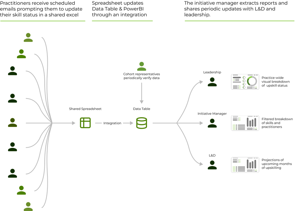
The second approach, which we ultimately implemented, was designed around automation and individual accountability. Practitioners received regular automated emails prompting them to update their skill progress directly. Cohort representatives played a light oversight role, verifying data accuracy on a periodic basis. This input was fed directly into a real-time connected data table, which then powered three distinct dashboard views in Power BI.
Each view was tailored for a specific stakeholder group: leadership, L&D, and management. This setup minimized delay, increased practitioner engagement, and ensured that leadership had access to up-to-date insights without depending on intermediary reporting layers.

We also focused heavily on interaction design. Each dashboard included:
-
Role-based navigation where tabs and buttons led users to the views most relevant to them.
-
Embedded definitions and tooltips: added guidance for less technical users exploring unfamiliar metrics.
-
Interactive filters and drilldowns enabled exploration by skill, designation, location, and learning stage.
Implementation
DATA INTEGRATION & BUILD
Working with the data collection team, I helped structure the dataset to align with dashboard requirements. I mapped fields like skill type, learning status, and expected completion date into a relational table, which allowed flexible filtering and comparison. This required cleaning inconsistent data entries, defining standardized fields, and coordinating with cohort reps to resolve missing or ambiguous entries.
We began with wireframes built in Excel to simulate the structure and logic of each dashboard view. This low-fidelity prototyping helped validate the layout and usability for non-technical stakeholders. Once the feedback loop confirmed our direction, we moved into full development using Power BI Desktop.
Visual consistency was a key focus. I established a shared design language across dashboards, consistent use of color codes, typography, and tooltip conventions, to reduce cognitive friction. Usability testing with both technical and non-technical users led to adjustments in tab layouts, KPI labeling, and how drilldowns were surfaced.

Outcomes
3x
faster reporting
This project reduced report turnaround from 3–4 days to under 1 day. With a data refresh and live dashboards, stakeholders no longer had to wait for manual consolidation and Excel-based summaries.
10+
in-demand skills
The identified skills through this initiative helped the leadership plan resource allocation, certification programs, and fast-track relevant training sessions, as well as preemptively respond to business needs.
This project taught me how to translate fuzzy user needs into concrete, role-specific dashboards. Working with this team gave me a clear sense of how good visualization enables better conversations, not just better metrics. It also crystallized for me how important data driven design is to not just businesses, but people.


Designing and Building Power BI Dashboards for analysis and reporting of Workforce Skills and Capabilities
Power BI / Power Automate / Delivery Planning

Project Snapshot
-
Led dashboard design and implementation for a practice-wide upskilling initiative within the Deloitte FP&A practice.
-
Created real-time Power BI dashboards linked to internal tracking tables with Power Queries built to transform and track individual and team progress across primary and secondary skill development.
-
Enabled leadership, L&D teams, and campaign managers to monitor progress, forecast skill growth, and identify intervention needs for non-ideal performers.
-
Delivered dashboards used to drive recognition campaigns, target learning sessions, and report progress to senior leadership. Awarded by the practice for the work in this initiative.
Client/Firm
Deloitte
Role
Power BI Analyst
Timeline
1 month
Team Size
3
Discovery
Problem Statement
How do we efficiently track and visualize the acquisition of multiple skills across a large team, while enabling real-time updates, filtering, and insight generation for leadership and learning teams?
WHY IS THIS A PROBLEM?
Every employer has a vital obligation to enhance the skill sets of its employees beyond their primary expertise to encourage growth both as a practice and individually. However, without a centralized tracking system, it was nearly impossible to monitor who was upskilling in what skill, identify defaulters, or reward high performers. The lack of visibility limited the campaign's strategic direction, hindered leadership reporting, and reduced motivation among team members. The L&D team also lacked insight into which skills were most in demand, making planning for future sessions reactive rather than proactive.
200+
Employees Tracked
Without structured oversight, individual performance and learning status were difficult to assess at scale.
3
Unique Stakeholder Groups
Each group had distinct needs, making it hard to create a unified view using traditional reporting methods.
>2d
to view latest reports
Reports were manual and due to infrequent updates, led to delays in decision-making and reduced campaign agility.
RESEARCH
I conducted exploratory research to uncover the core needs and expectations of the stakeholders. My primary research approach was one-on-one unstructured interviews with key stakeholders such as the L&D staff, initiative manager, and a sample of employees at various levels. These interviews were designed to uncover pain points regarding the existing process, which was primarily excel based and manually tracked. Secondary research included an audit of past iterations of the campaign, reviewing upskilling performance reports, and analyzing SharePoint records and previous data to identify common patterns and pitfalls.
From this research, I uncovered clear thematic needs across the board:
Leadership needed Clear Visuals
Executives wanted a quick and clear view of progress across teams, with drill-down options for team-level monitoring.
L&D needed Skill Gaps and Forecasts
The L&D team required visibility into popular skills, lagging areas, and upcoming demand to inform lesson planning.
Employees needed Transparency
Practitioners wanted to see how they were progressing relative to peers and understand how their efforts were being recognized in order to continue to feel motivated about spending time outside of their projects to upskill themselves.
This helped build a grounded understanding of the challenges faced by each group. It was clear early on that data visibility, accuracy, and ownership needed consistency across teams. Employees felt disconnected from the process, while managers lacked the tools to track progress in real time. This set the stage for a deeper look into how data was collected and how it needed to flow through the system.
Core Needs
1
Visibility drives Engagement
As highlighted during interviews, when employees could see their standing, participation and completion rates improved.
2
Forecasting Matters
Predictive views helped the L&D team plan resources and proactively engage low performers.
3
One Size does not Fit All
Different users needed very different views, which reinforced the need for segmented dashboards.

Identifying the points of friction across stakeholder roles reinforced the importance of building a solution that was not only technically accurate but also logistically intuitive for users at every level. By identifying breakdowns in handoffs, delayed reporting, and inconsistent engagement, we were able to advocate for automation, self-service inputs, and segmented dashboard views that directly addressed each persona's pain points.


